G107
Cargo Transportation
For over 14 years, G107 transportation company has been reliably handling daily cargo shipments from China to Russia, Kyrgyzstan, and Kazakhstan. Their long-standing success is built on consistency, trust, and efficient logistics across borders.
GOAL
To design and develop a clean, single-page website that clearly communicates the company’s services while staying visually appealing and easy to navigate. It needed to help users quickly understand what the company offers and make it effortless for them to get in touch, all without overwhelming them.
SOLUTION
Using our design and development skills, we created a clean, single-page website that clearly showcases the services of G107. The result is a smooth and user-friendly experience where visitors can quickly understand the routes, feel confident in the company’s reliability, and easily reach out for cargo transport from China to Russia, Kyrgyzstan, and Kazakhstan.
WHAT WE DID
Consulting, planning, managing, wireframing, designing and programming.
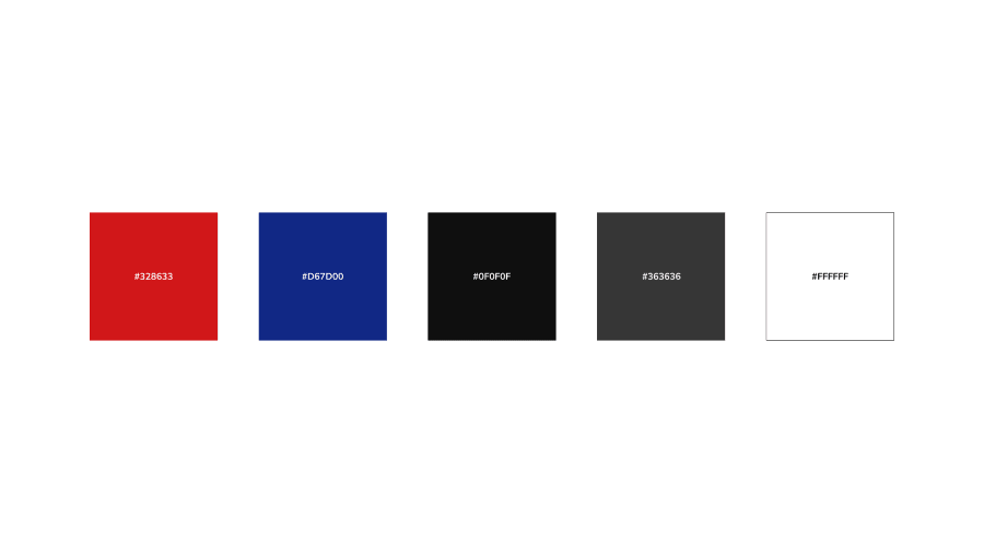
Color Palette
The client gave us a unique set of brand colors, and our job was to build a color palette for the website that stayed true to those tones. We carefully refined the colors so the site feels vibrant and dynamic, perfectly reflecting the energy of their business.
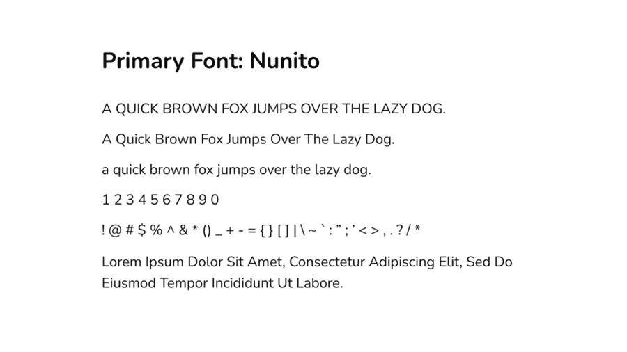
Typography
We carefully selected fonts that not only matched the brand’s personality but also worked beautifully across different people. We paid close attention to sizing, spacing, and readability to make sure the text feels balanced and easy to read on any device.
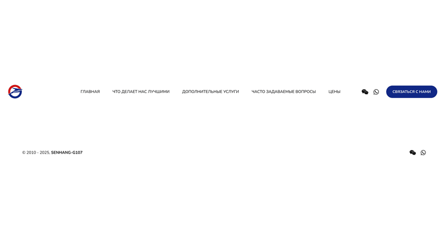
Layout
The OSDSE team designed the header and footer to flow perfectly together, making it super easy for visitors to navigate the site and quickly find what they’re looking for on the website.
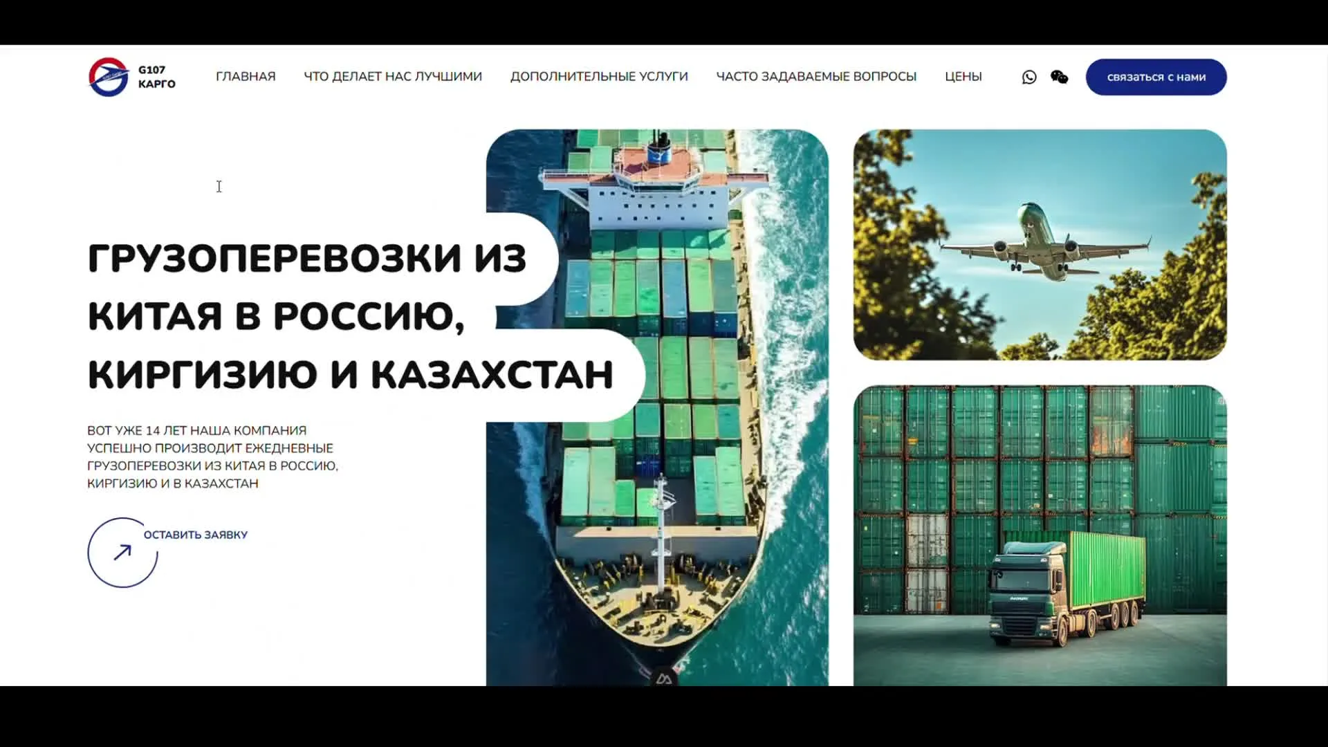
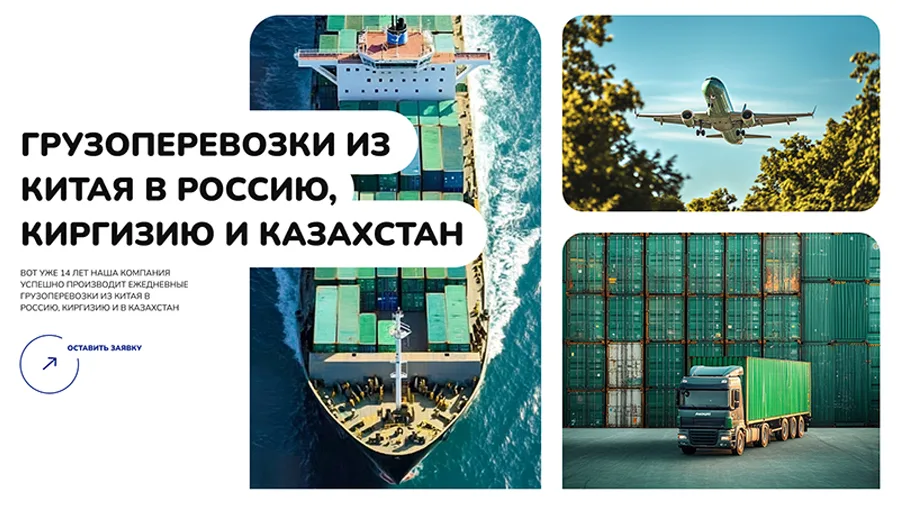
Hero
We designed a unique hero section that instantly shows what the company does at a glance. Bold text, a clear description, and a strong and unique call-to-action make it easy for visitors to understand the business and get in touch right away.
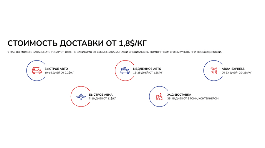
Pricing
Right after the hero, we placed the pricing section so visitors can immediately see what they’ll get and at what cost. Each pricing option has its own unique icon and color to stand out, but we kept the overall style cohesive so they still feel like part of the same family.
Process
We kept the process section unique and clear by breaking everything down into individual cards. Each card highlights a single step with all the details, making it super easy for visitors to follow along.
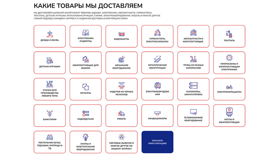
Products
The products section gives users a clear idea of what types of items they can ship to their desired countries. Each product is displayed in its own card with a unique icon, making it easy to scan and understand at a glance. And at the end, we added a strong call-to-action so if they’re ready, they can quickly reach out without any extra clicks or inquire about products.
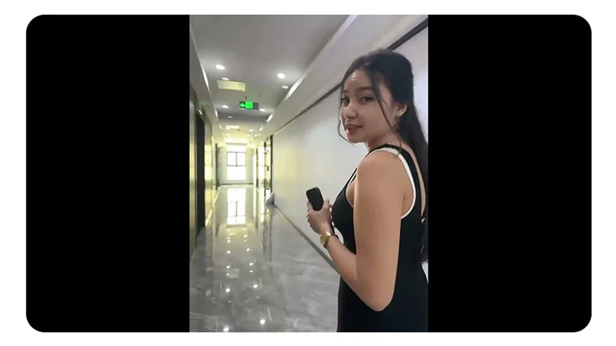
Video
We added a simple yet unique video to give users a quick tour of the company’s office. It’s a great way for them to get a feel of the place and connect with the brand even if they can’t be there in person.
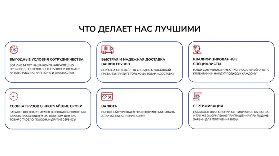
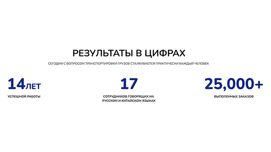
About
We created a clean company history section with a clear title, short description, and three key points. It highlights how many years they have been in service, how many clients they have worked with, and other impressive stats all in a easy-to-read format.
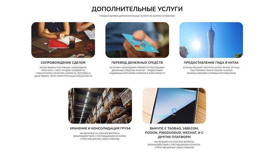
Additional Services
We designed an Additional Services section to showcase everything the company offers beyond shipping from supplier negotiations and money transfers to cargo consolidation and purchases from platforms like Taobao and 1688.com all in one clear, easy-to-read place.
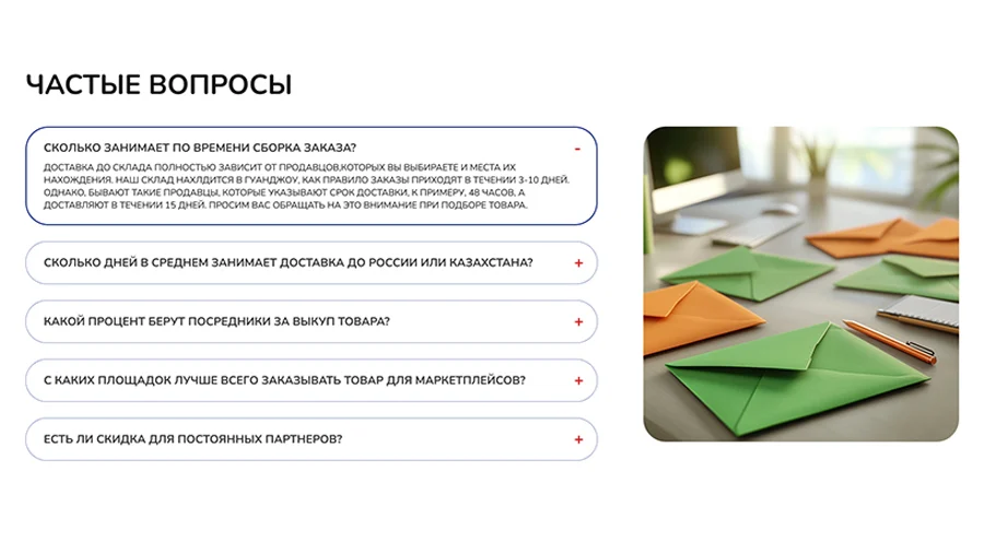
FAQ
We added a well-structured FAQ section to answer the most common questions customers might have. This helps visitors quickly find the information they need without having to reach out, making their experience smoother and saving time for both the company and the clients.
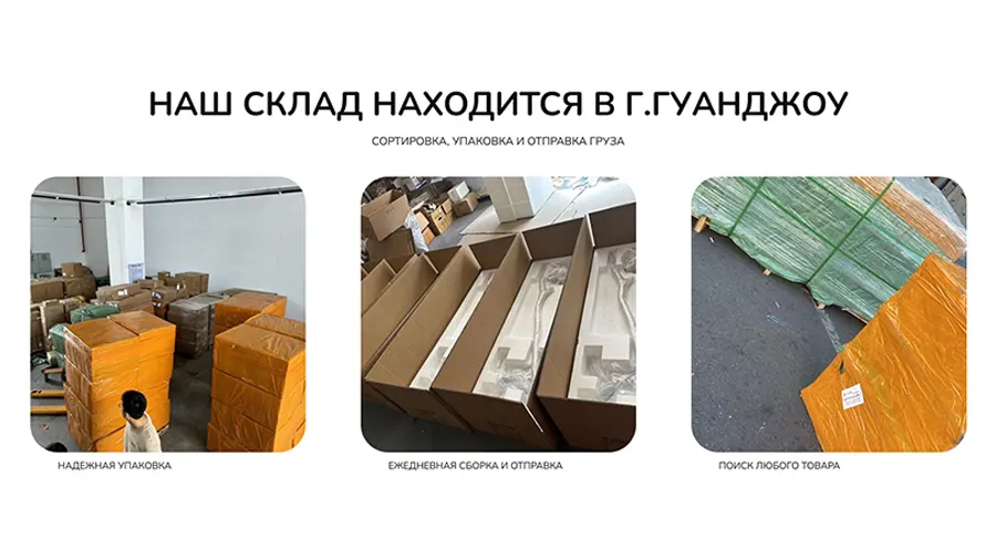
Warehouse Gallery
We created a warehouse gallery section to visually show how the company carefully handles and ships products. The photos build trust by giving customers a behind the scenes look at the safe and organized process.
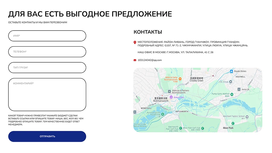
Contact
A clean and straightforward contact section that makes it easy for visitors to reach out. With a simple form, clear location details, and an embedded map, customers can quickly leave their info or find the company’s offices without any hassle.
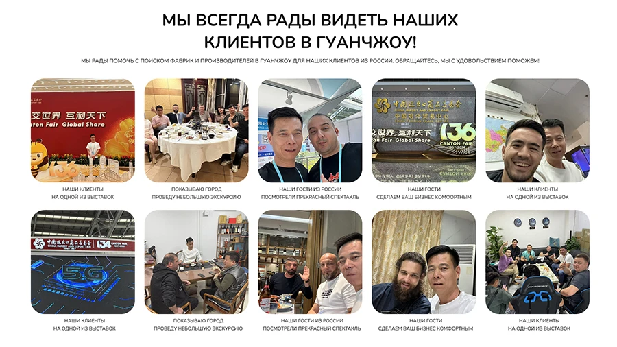
Office Gallery
We added an office gallery to showcase the company’s welcoming environment and vibrant culture. It gives visitors a glimpse of the happy atmosphere and the kinds of events and activities the team enjoys, helping build a more personal connection with the brand.
More Proud AND
AWESOME PROJECTS
Explore more exciting and awesome work! Check out the archive and fill yourself with tech world.
MORE WORK