IAPE
Interactive Architects and Planners
IAP Education (IAPE), the training division of IAP, empowers future talents with interactive education programs designed for skill development and career growth.
GOAL
To create a website for IAPE that reflects their mission of empowering future talents. The focus was on designing a modern, engaging platform that showcases their interactive programs, supports skill development, and helps learners explore new opportunities for career growth with confidence.
SOLUTION
Using our design and development skills, we built a clean, engaging website for IAPE that brings their mission to life. The result is a user-friendly platform where students can easily explore programs, understand learning paths, and feel inspired to grow their skills and careers through interactive education.
WHAT WE DID
Consulting, planning, managing, wireframing, designing and programming.
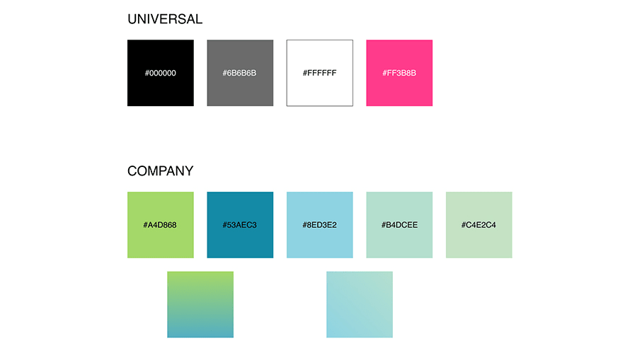
Color Palette
We took IAPE’s original brand colors and gave them new life on the website. By blending soft gradients and choosing accessible combinations, we made sure the site feels modern, easy to look at, and still true to who they are. The result? A color palette that works beautifully on screen and feels right for their audience.
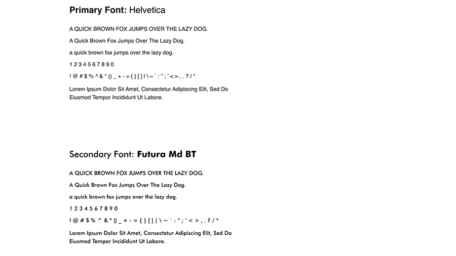
Fonts Family
The client picked Helvetica and Futura MD BT as their brand fonts, and it was our job to make them work beautifully together. We used each where it made the most sense, clean, clear text for reading and bold, modern type for impact, so the whole site feels smooth, easy to read, and true to IAPE’s personality.
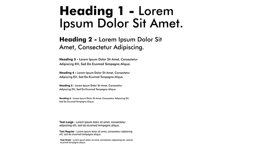
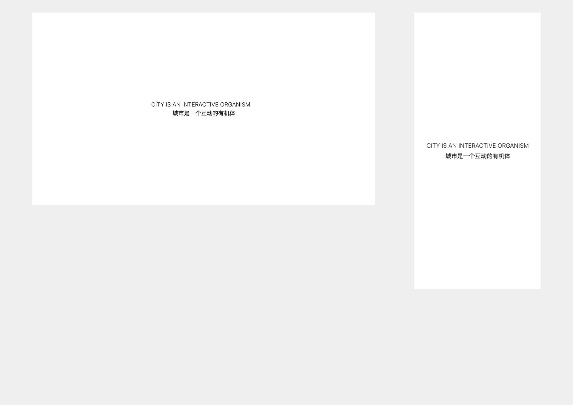
Typography
We took the fonts the client loved and turned them into a smooth, flexible typography system. Whether you are on a phone or a giant 4K screen, the text stays clean, easy to read, and feels right no squinting, no awkward sizes, just a great reading experience everywhere.
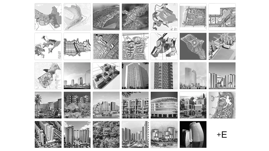
Projects
We showcased the projects in a clean, responsive grid that is easy to browse on any device. Each project is clearly labeled, whether it's from IAP or IAPE, so users always know what they’re looking at. With smooth animations and a bold “+E” button, the section feels modern, interactive, and fun to explore.
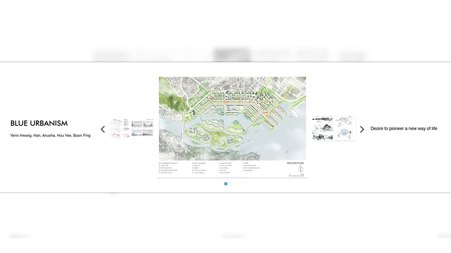
Single Project
Each project is laid out with a clean, left-to-right flow. The title and key info sit clearly on the left, important visuals are centered, and a short, easy-to-read description is placed on the right. This structure helps visitors instantly understand what the project is about, without any confusion or extra effort.
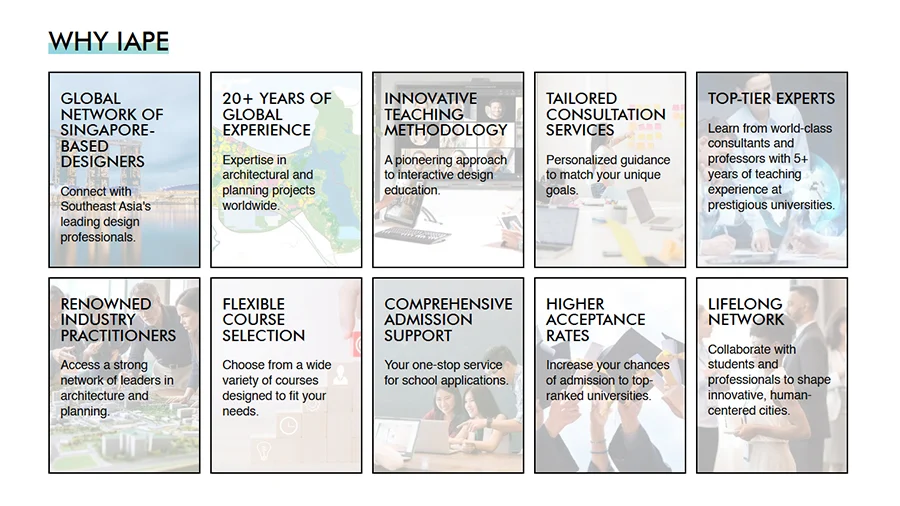
Why IAPE
We designed the "Why IAPE?" section using 10 well spaced cards that highlight the institute’s strengths without overwhelming the user. Each card features a light background image, a clear title, and a short, sweet description, making it easy to scan, understand, and feel confident in what IAPE stands for.
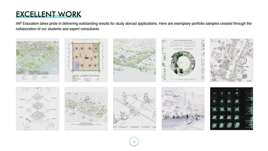
Excellent Work
We showcased their best work in beautifully designed cards that keep things clean and engaging. When you hover, the project title appears, and with a click, you can dive into all the details. To keep it smooth and organized, we show 10 at a time with an arrow button to load more, simple, sleek, and satisfying to explore.
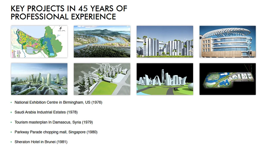
Key Projects
The Key Projects section is like a hall of fame, celebrating over 45 years of IAPE’s impact around the world. It opens with a beautifully designed hero featuring multiple images that reflect their journey. Below that, a well-structured list showcases their most significant projects, highlighting what they have accomplished across the globe, one milestone at a time.
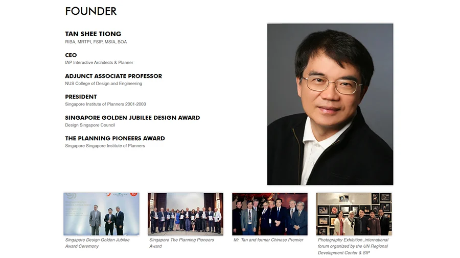
Founder
We created a beautifully designed founder’s section that shares his background, education, and experience in a clear, engaging way. To keep it visually balanced, we included just four award photos, enough to showcase his achievements without overwhelming the user, making the section feel both personal and inspiring.
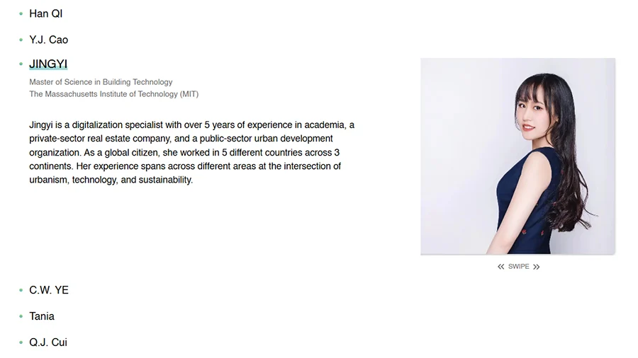
Team
We showcased the team in a clean list. Clicking on a member reveals their photo and a short, sweet description of their accomplishments. The images are swipe-able, making it easy for visitors to browse through and get a sense of what each person has achieved, bringing the team’s talent and experience to life in an engaging way.
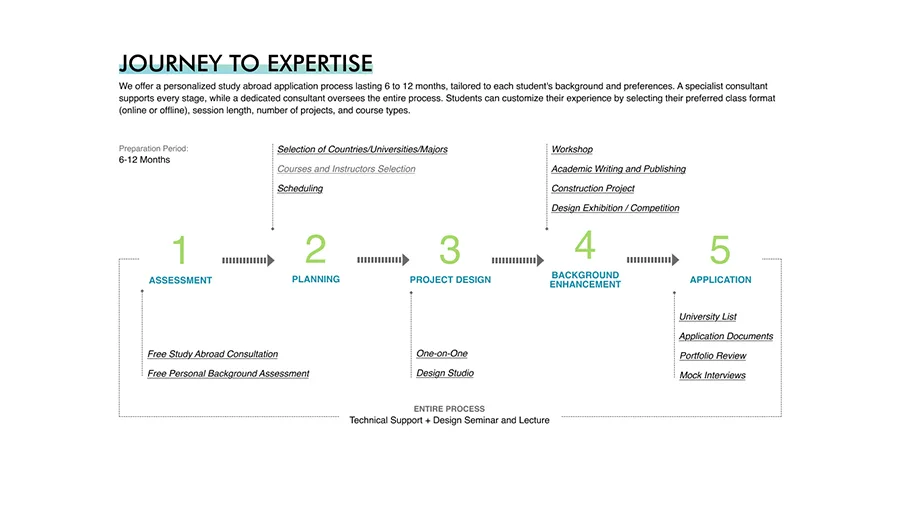
Journey to Expertise
We brought the “Journey to Expertise” to life with a beautifully designed diagram paired with smooth animations. It keeps visitors engaged while clearly showing the milestones and growth that shaped IAPE’s expertise making it easy to see where they have been and what they are working toward.
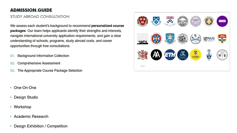
Guides
We showcased the guides in a clean, visually appealing list, complete with images to draw attention. Visitors can easily click through topics like how to get admission to universities and more. The layout is simple to navigate, making it a smooth and enjoyable way for users to access the knowledge they are looking for.
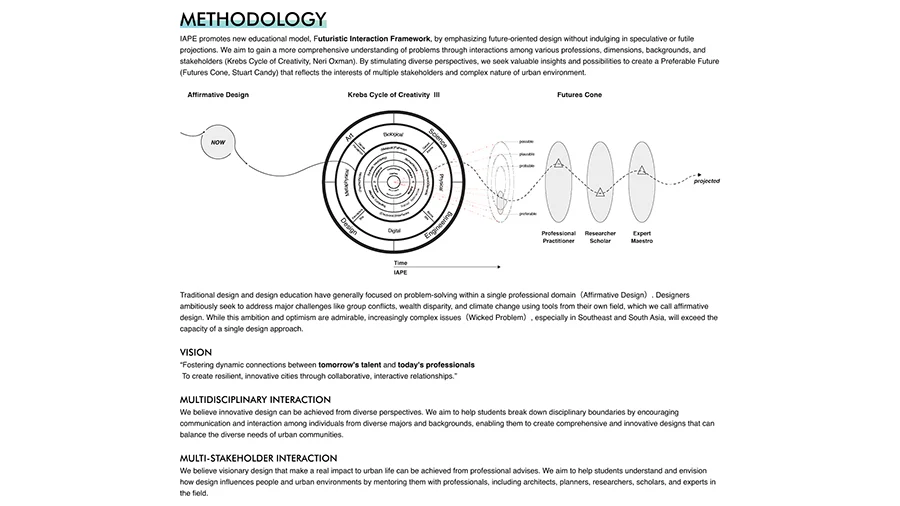
Methodology
We designed the Methodology section to be both beautiful and engaging, starting with an animated diagram that draws people in. Below it, clear titles and well-written paragraphs break down each part of the approach, making it easy for visitors to understand the meaning and process at a glance.
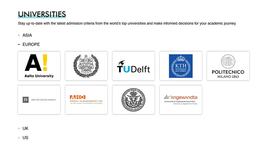
Universities
We showcased the universities in beautifully designed cards, organized by region for easy browsing. With a single click, visitors can open a dedicated university page to explore more details, making the experience smooth and informative.
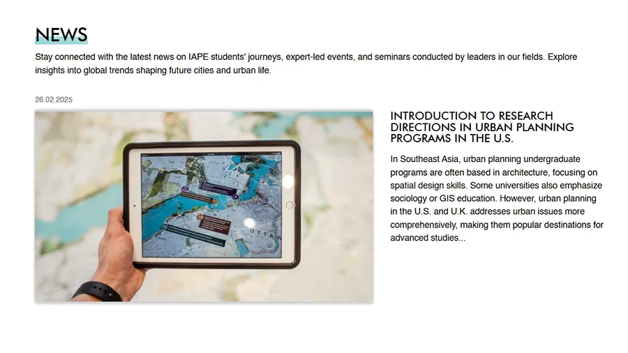
News
We displayed the news in clean, beautifully designed cards, showing just two latest media at a time to keep things neat. Visitors can click the button to explore older updates, making it easy to stay informed without feeling overwhelmed.
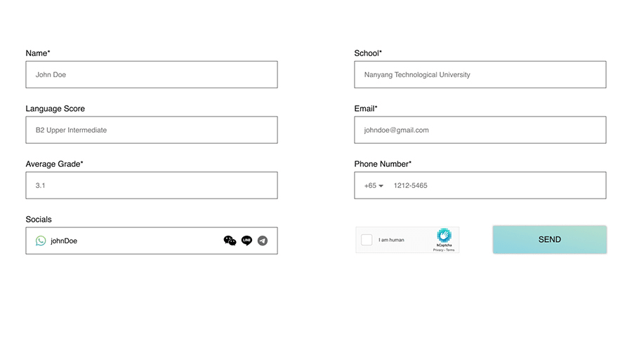
Contact Form
We designed a sleek, modern contact form with clear placeholders that guide visitors on how to fill it out. The social media field has a unique touch, users can simply click their preferred platform and enter their details, making the whole process quick and user-friendly.
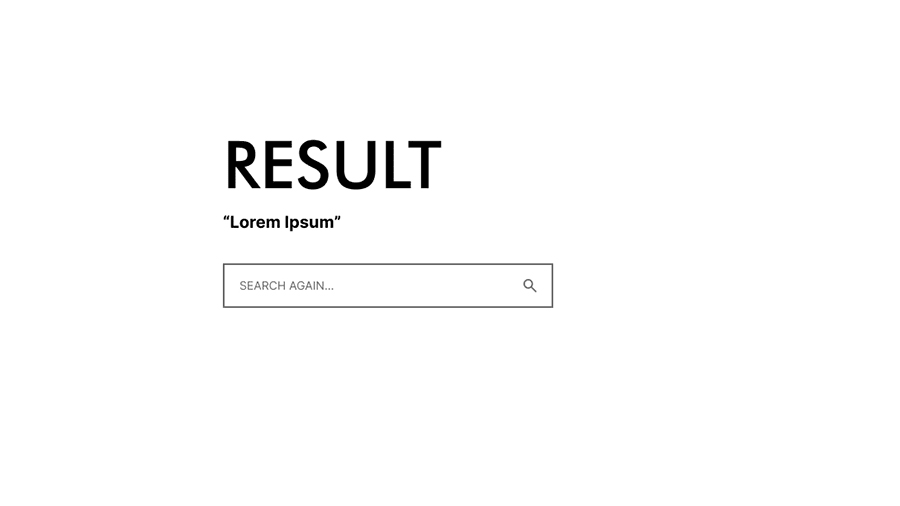
Search Result
We designed the search results page to be both functional and user-friendly. It not only displays the results for the query but also keeps the search form right there, so visitors can instantly refine or start a new search without leaving the page.
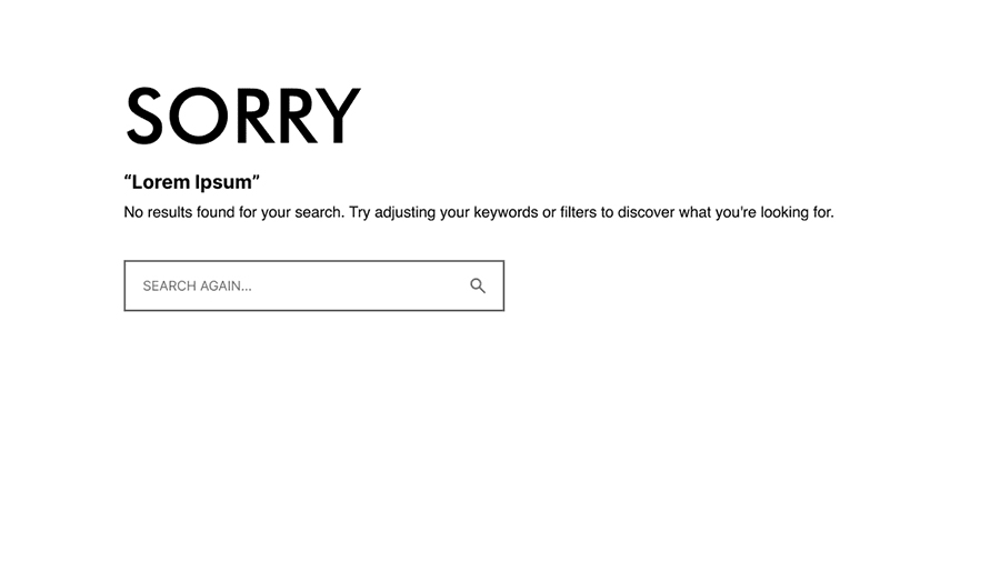
No Search Result
We designed the ‘No Results’ page to be more than just a dead end. It’s visually appealing, offers a friendly apology, and provides a search form along with helpful guidance, so visitors can quickly try again and find what they’re looking for.
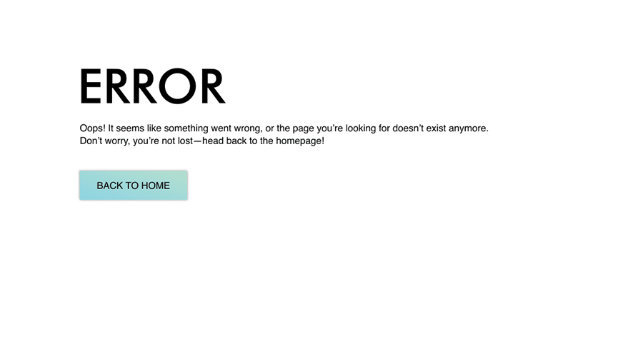
Error
We created a clean and clear error page that instantly lets visitors know the page wasn’t found or have an error. A short, friendly message explains the issue, and a bold button makes it easy to head back to the homepage and continue browsing without frustration.
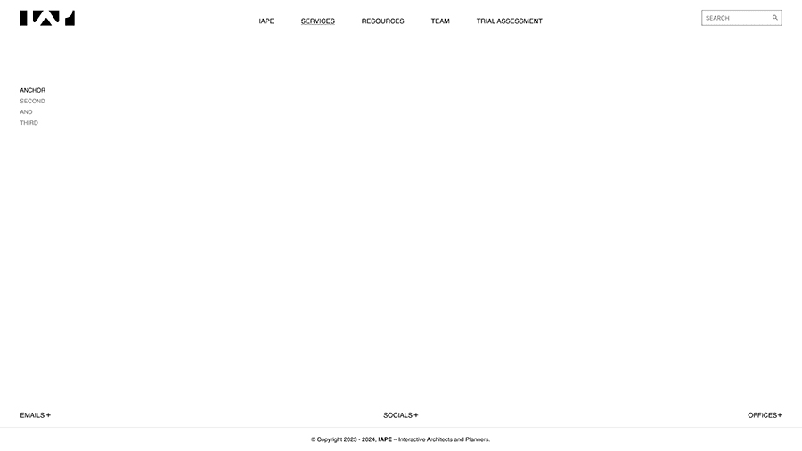
Layout
The header and footer were designed to work perfectly together, creating a smooth flow across the site. This makes it effortless for visitors to navigate, quickly find what they’re looking for, and always have key links right at their fingertips, no matter where they are on the website.
WIREFRAME WALL
 Home
Home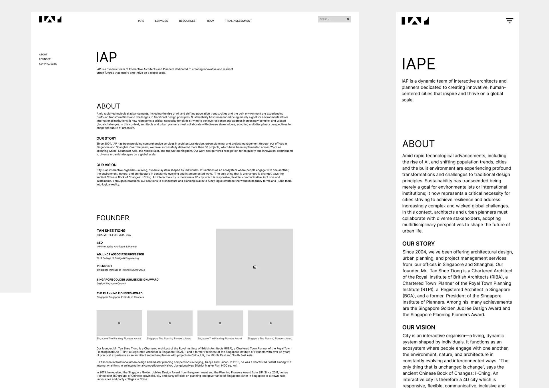 IAP
IAP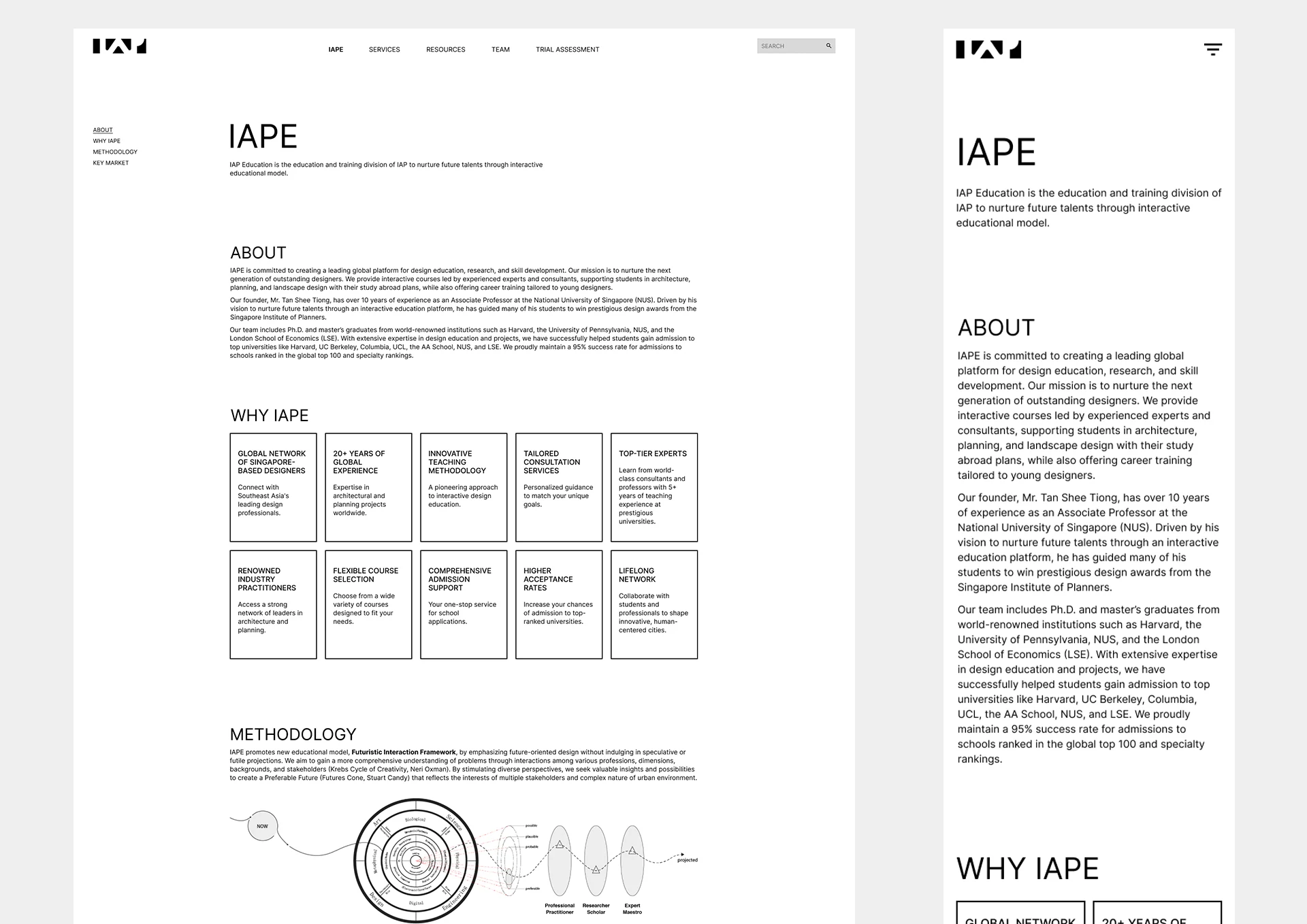 IAPE
IAPE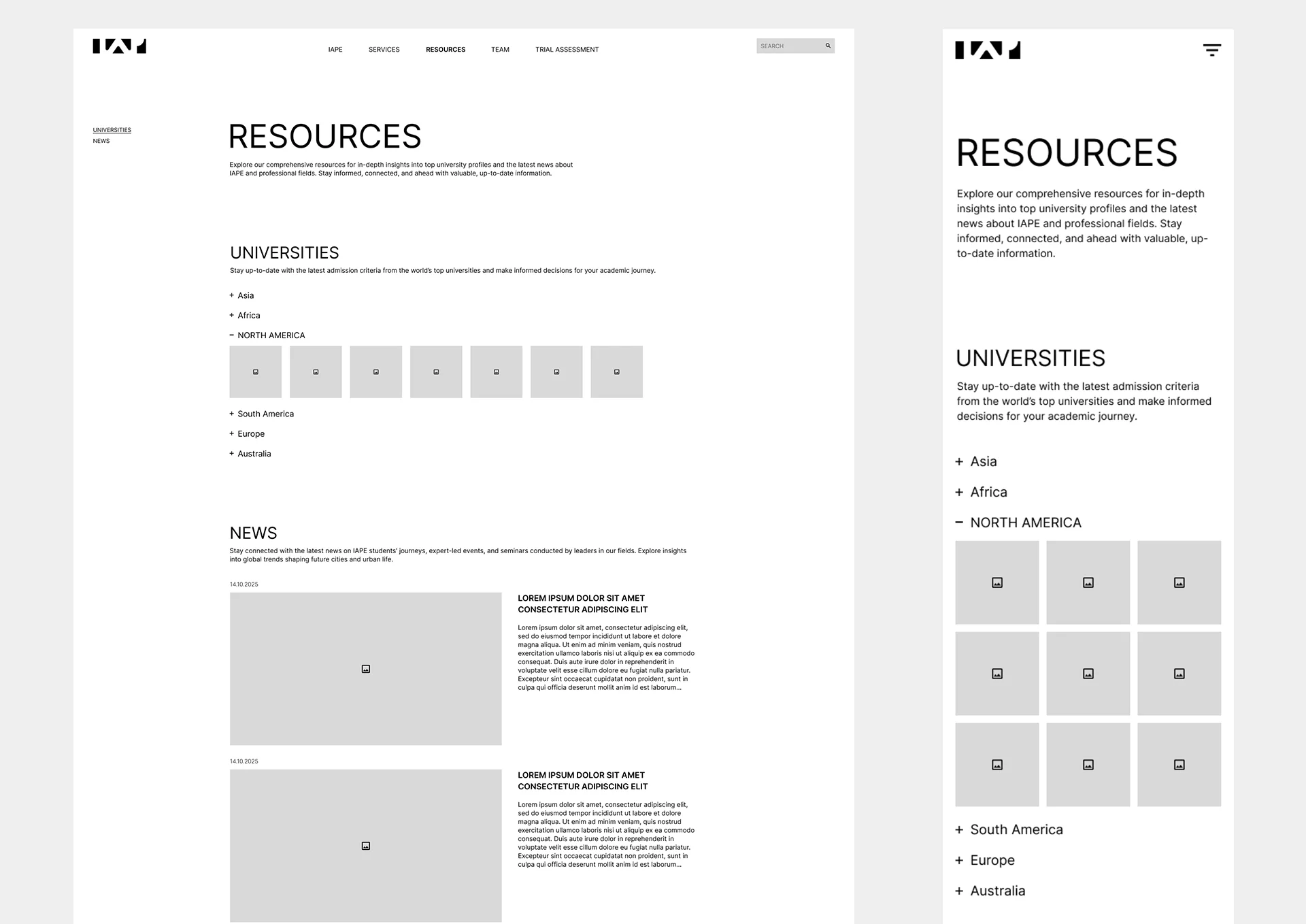 Resources
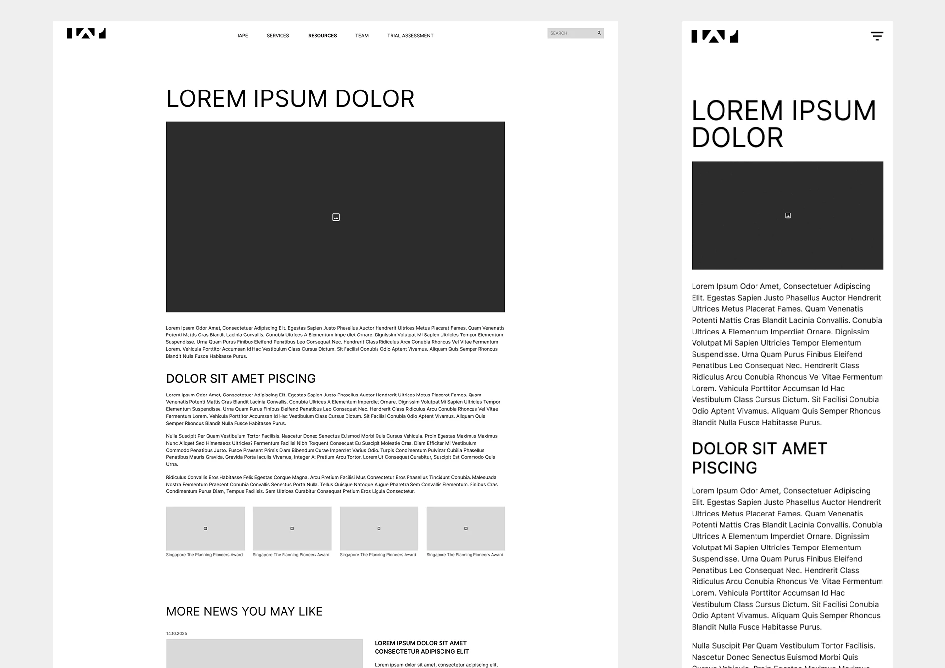 Single Resource
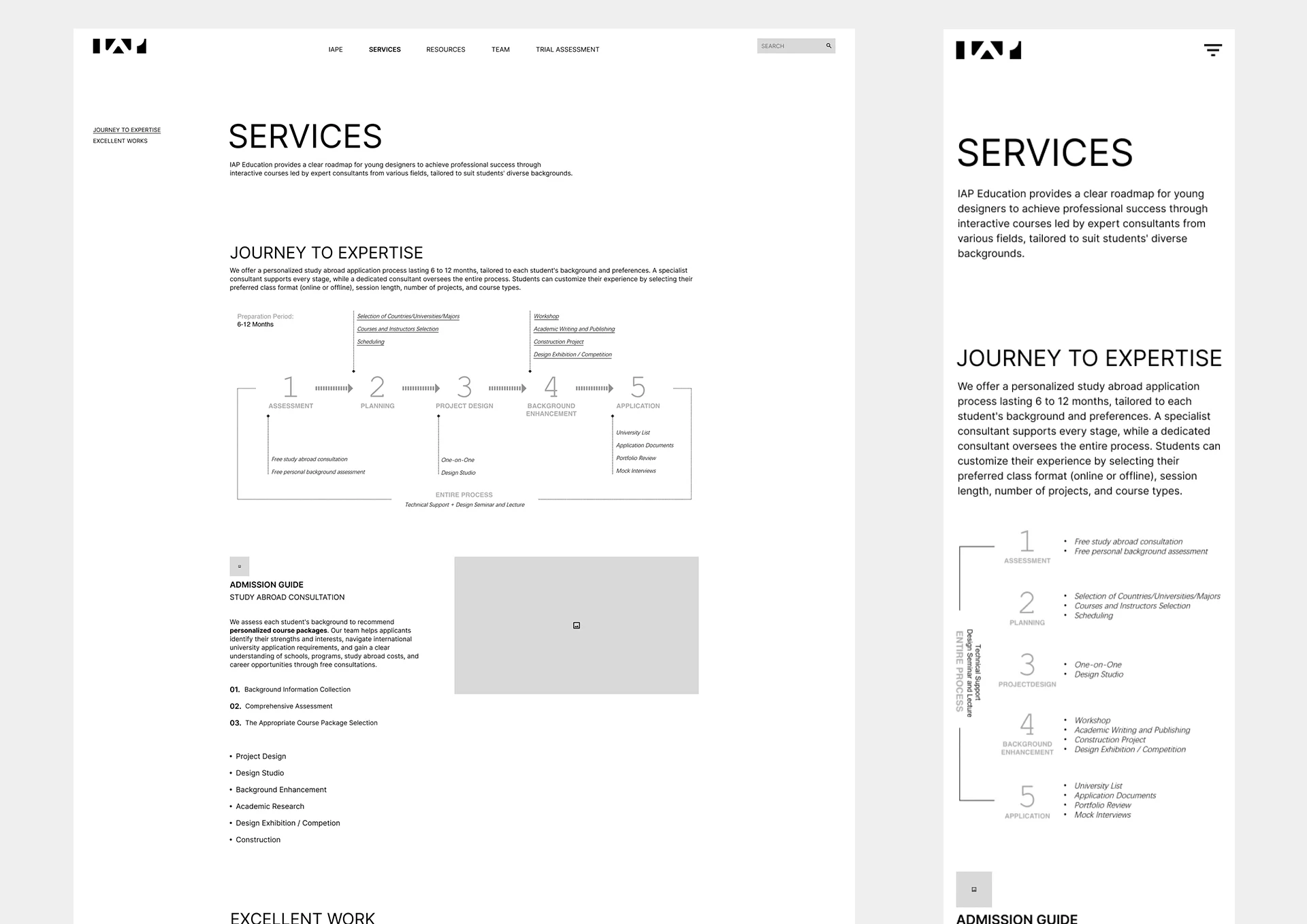 Services
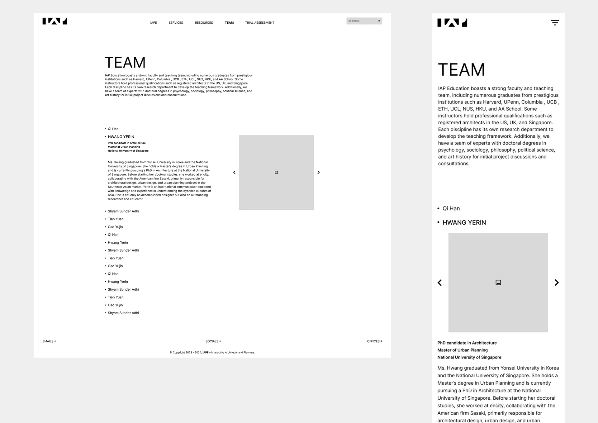 Team
Team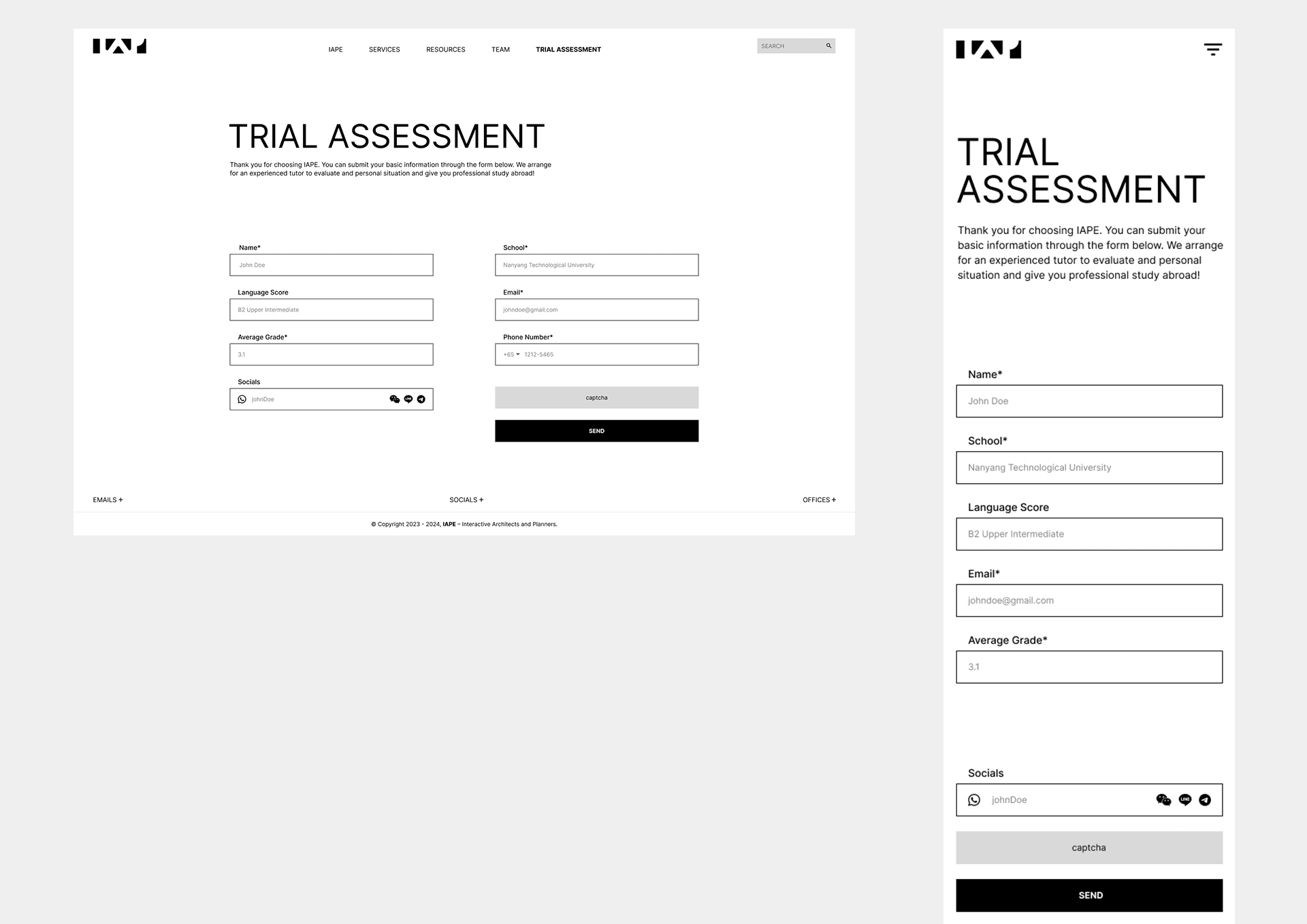 Trial Assessment
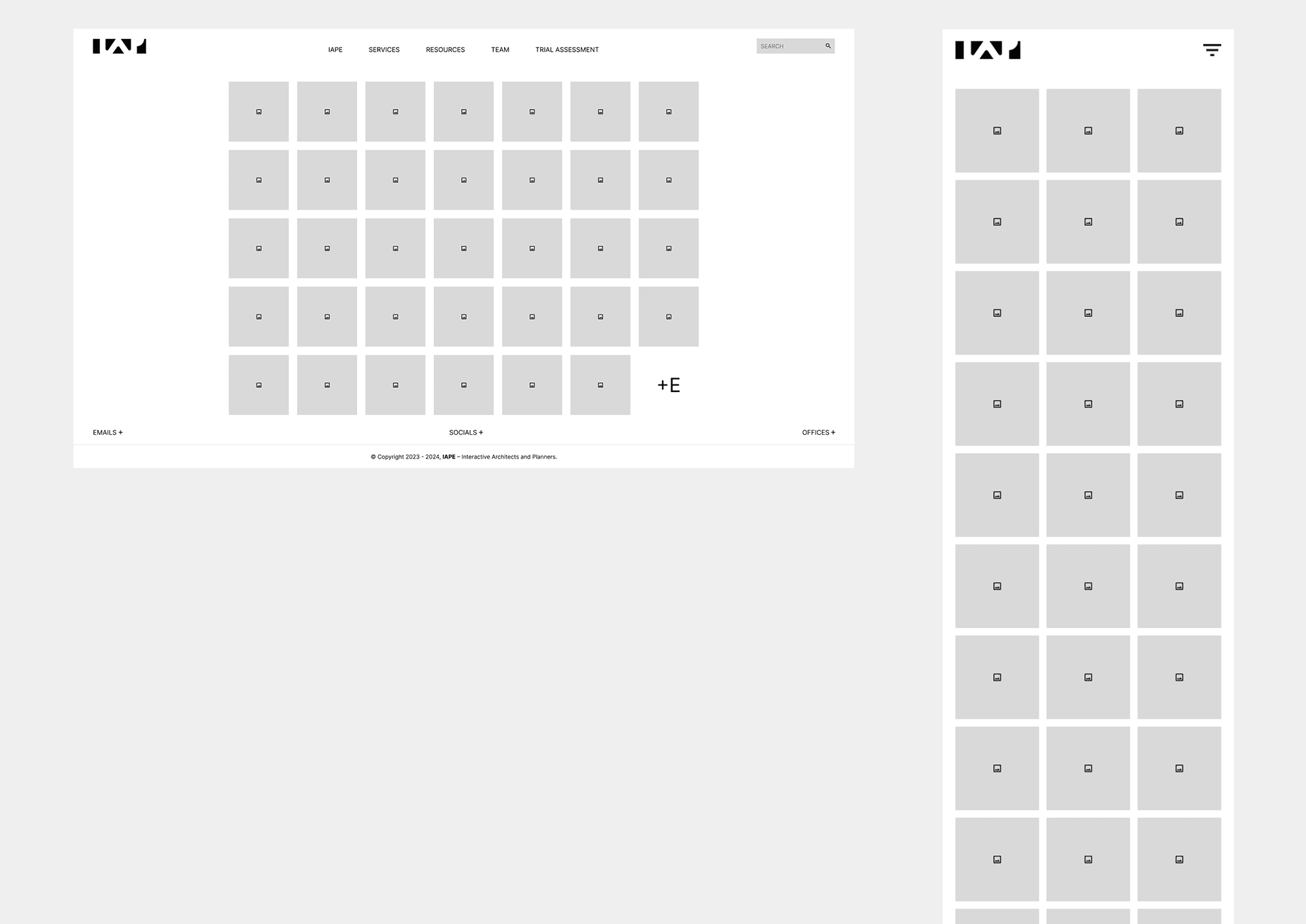 Projects
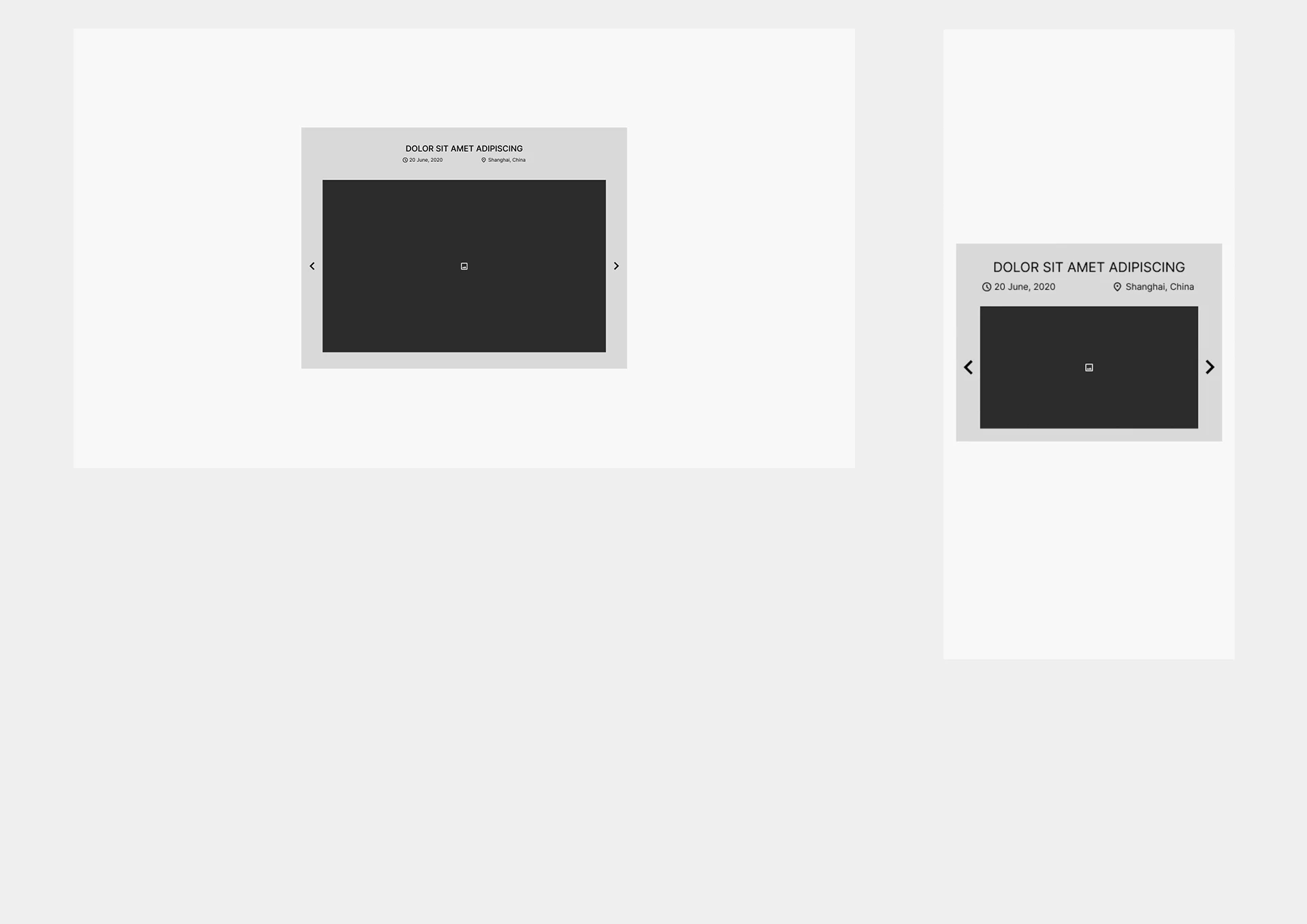 Single Project
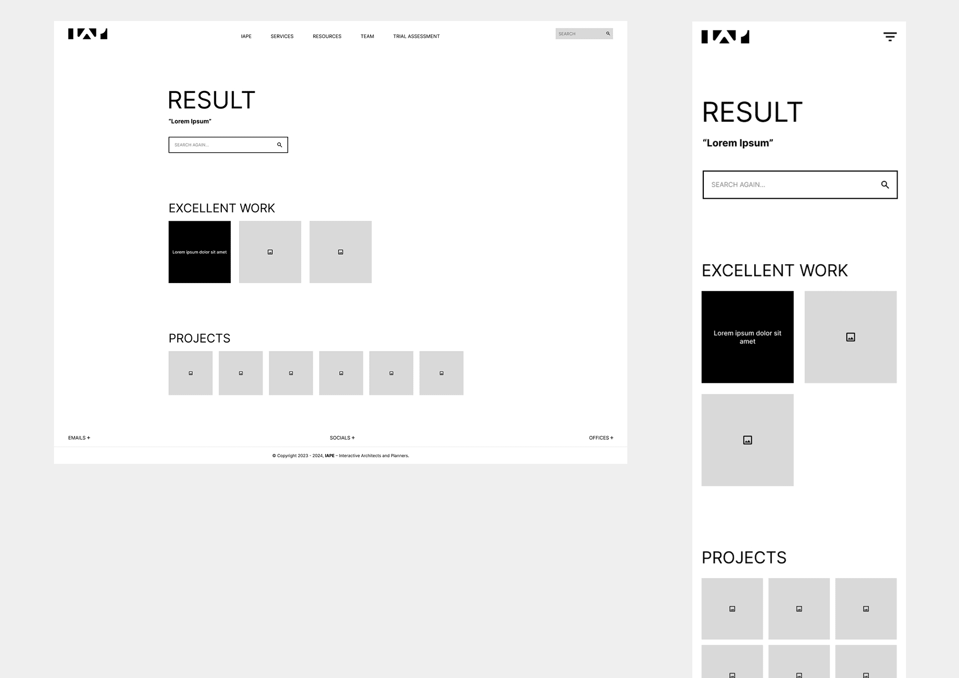 Search Result
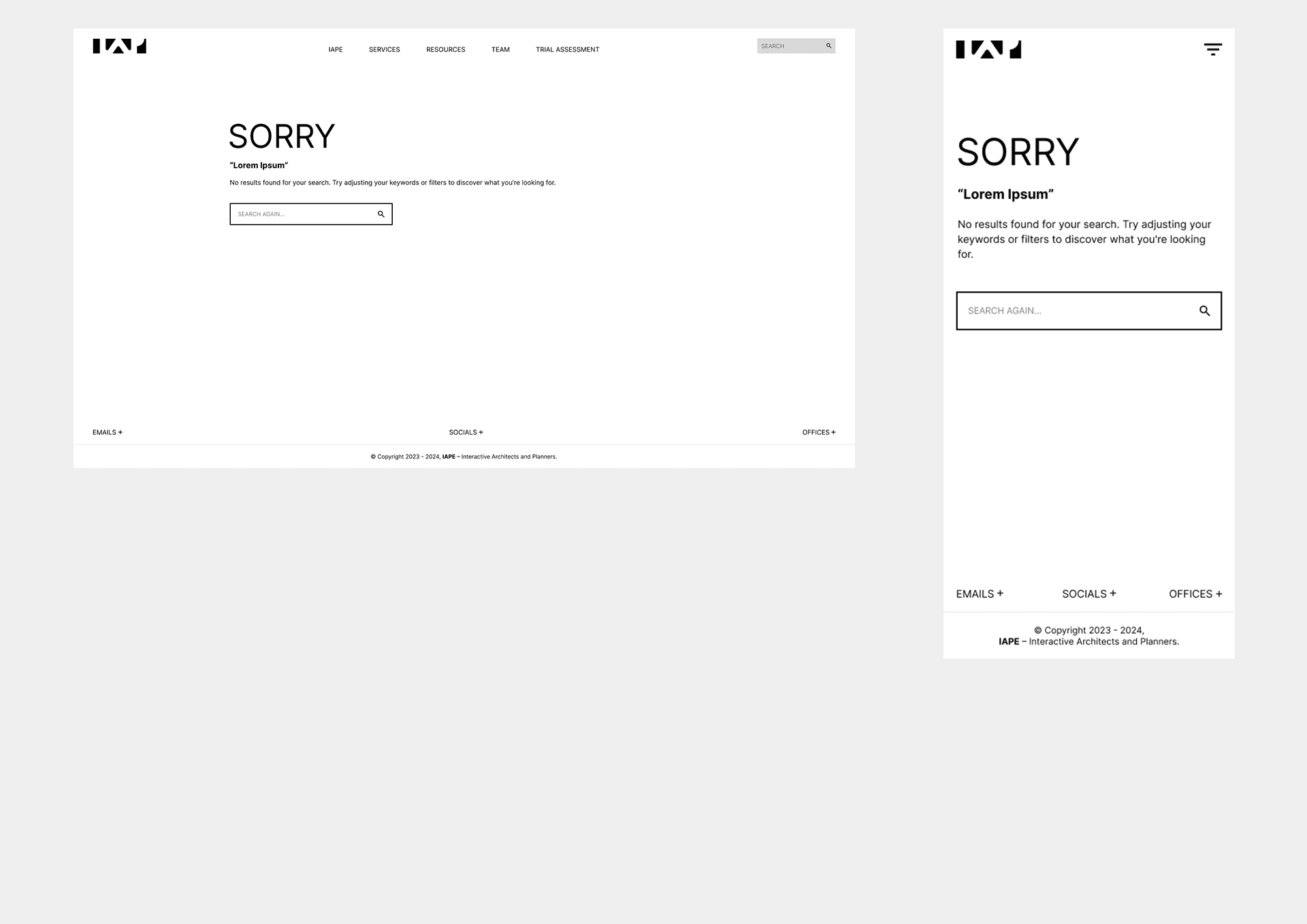 No Search Result
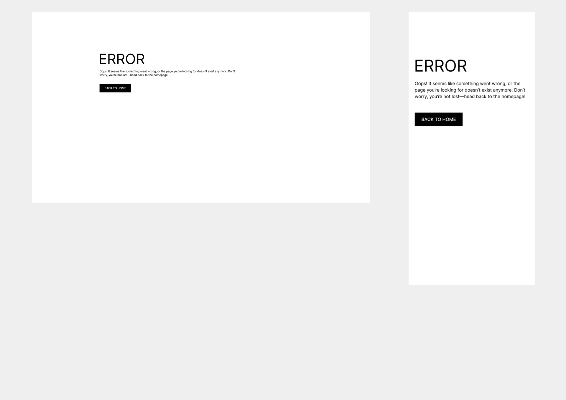 Error
Error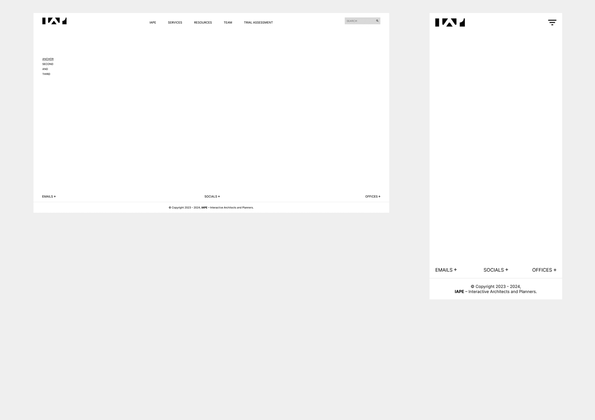 Layout
DESIGN WALL
 Home
Home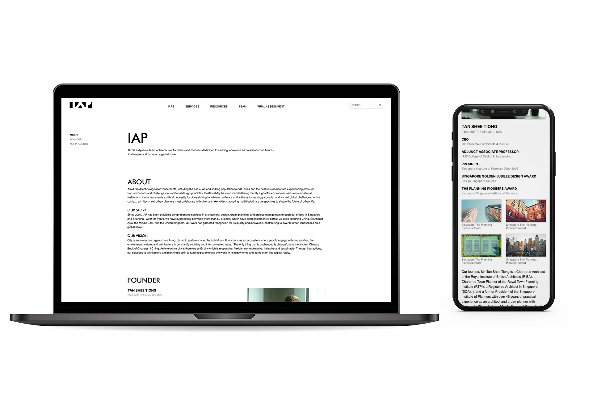 IAP
IAP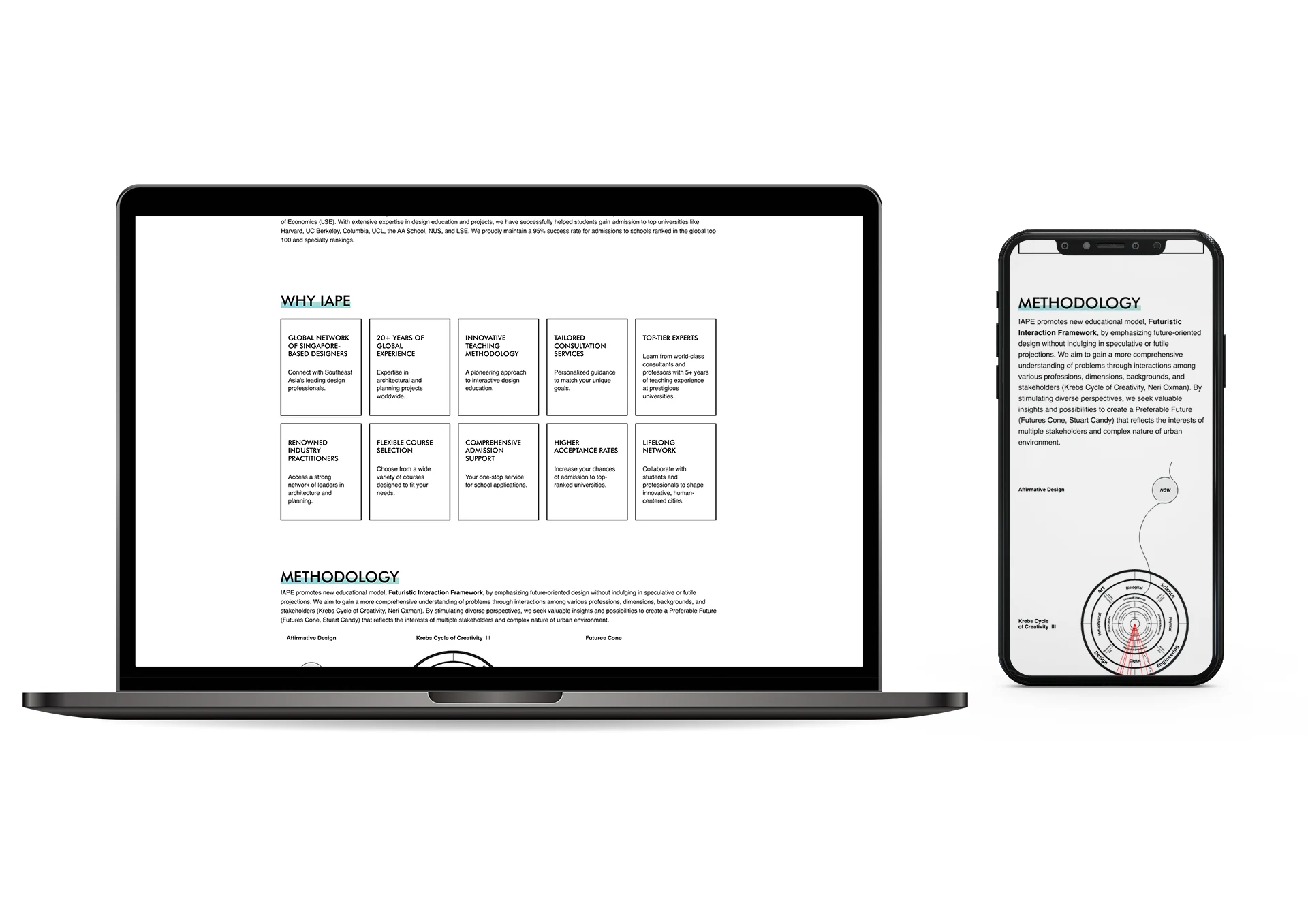 IAPE
IAPE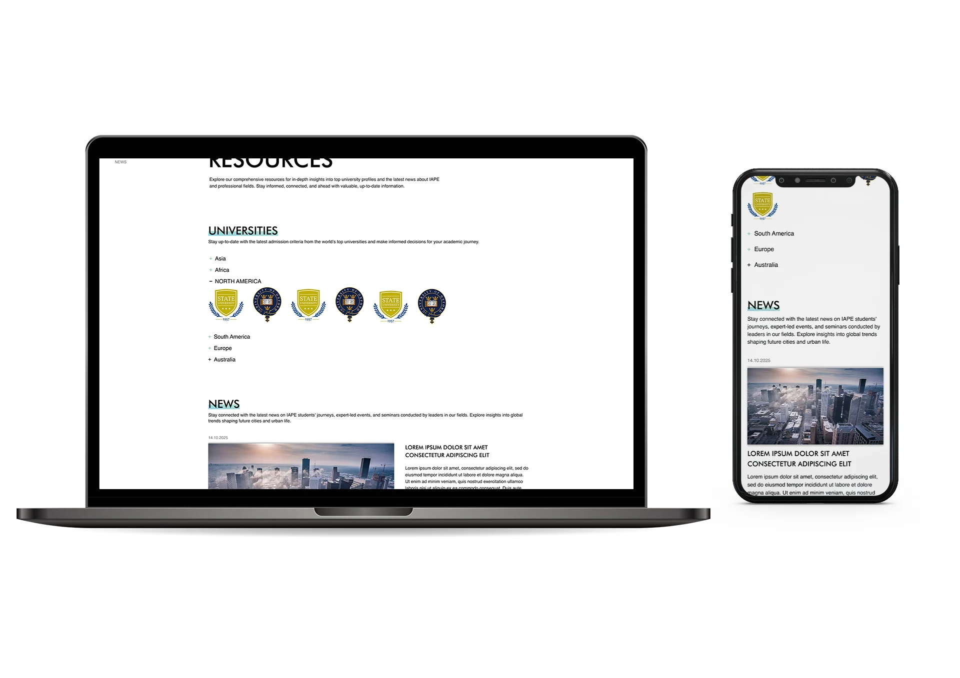 Resources
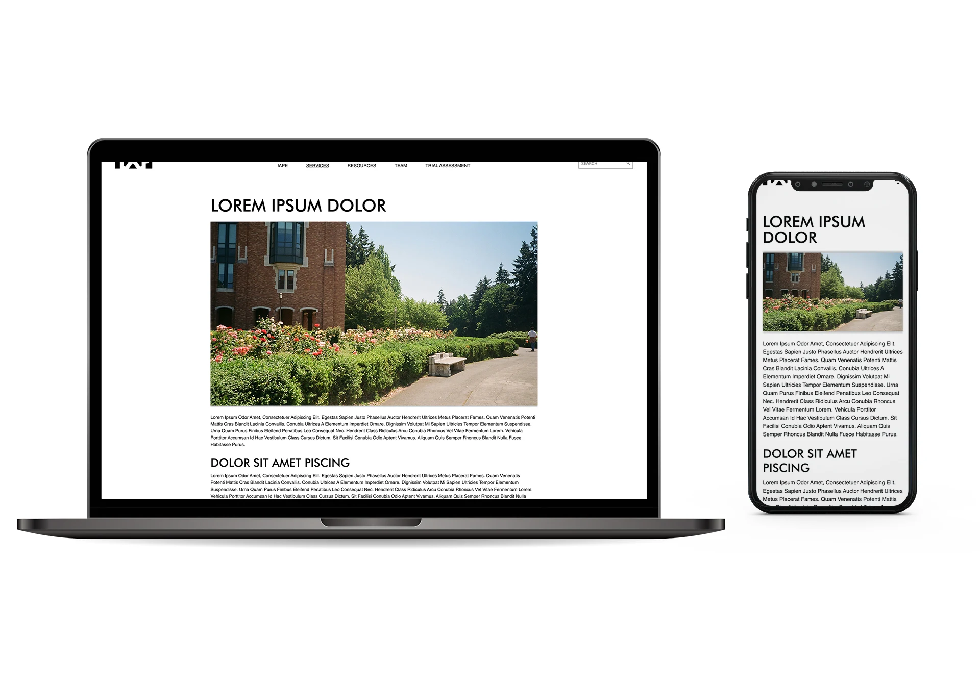 Single Resource
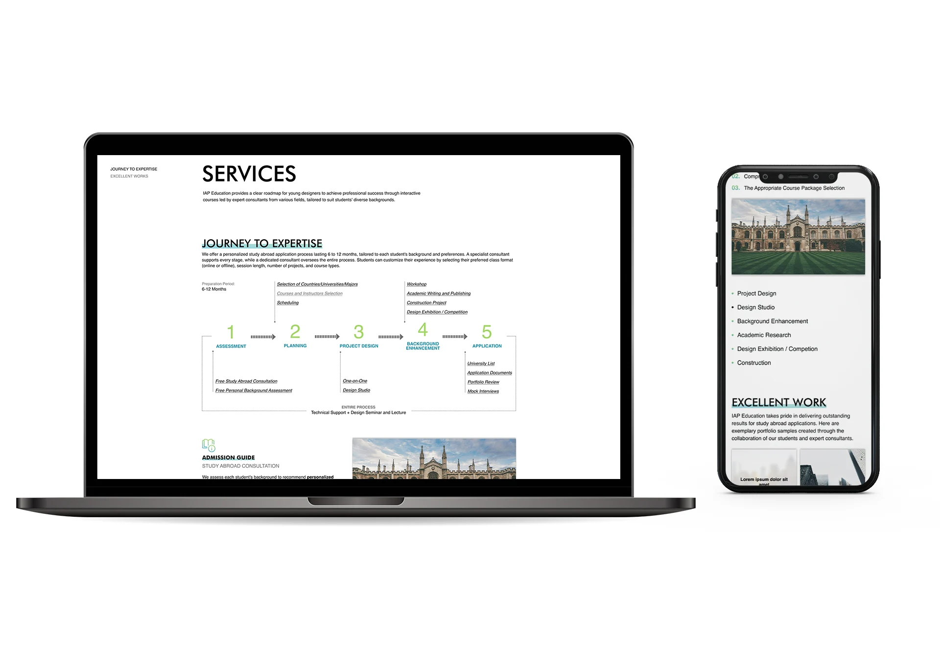 Services
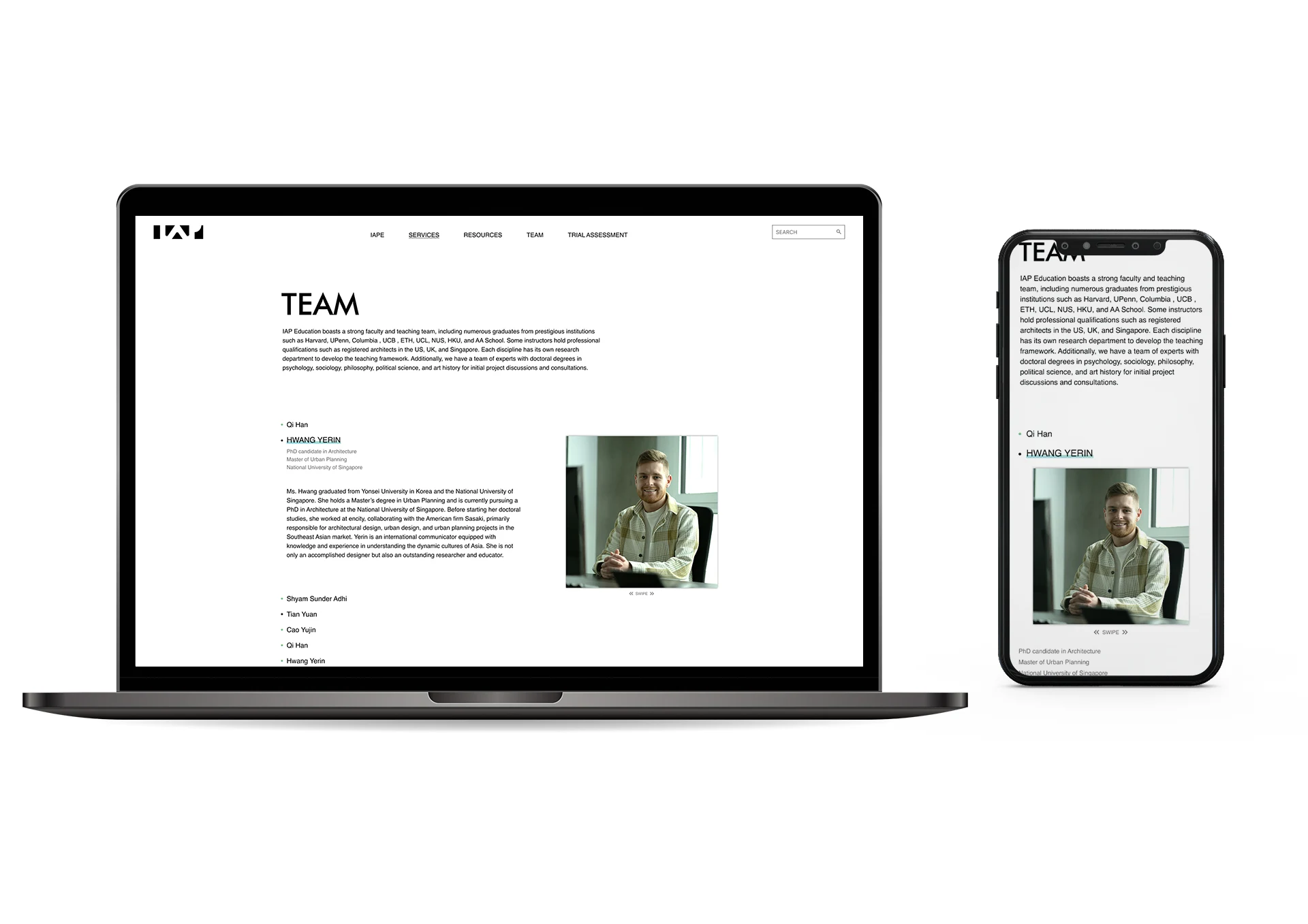 Team
Team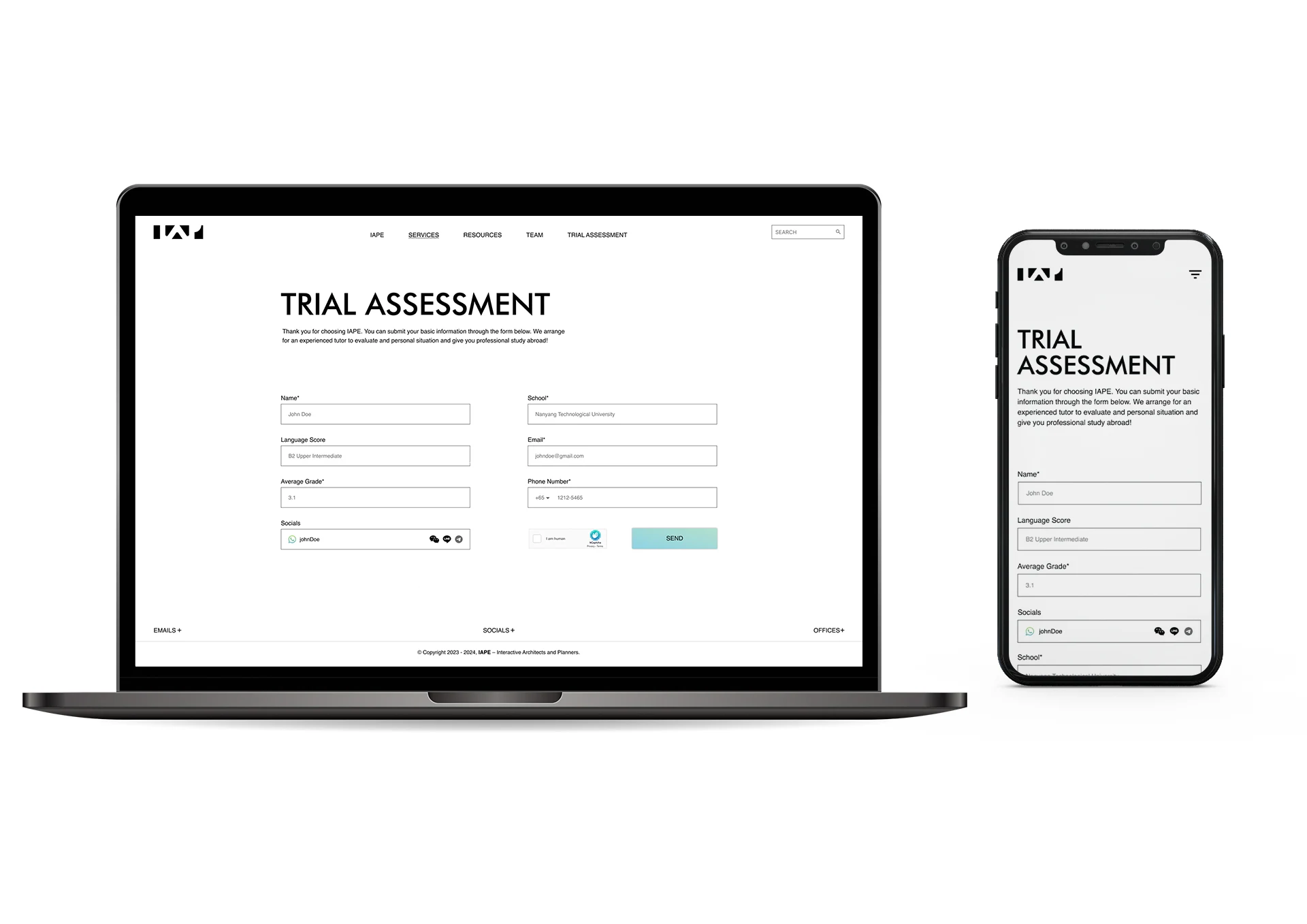 Trial Assessment
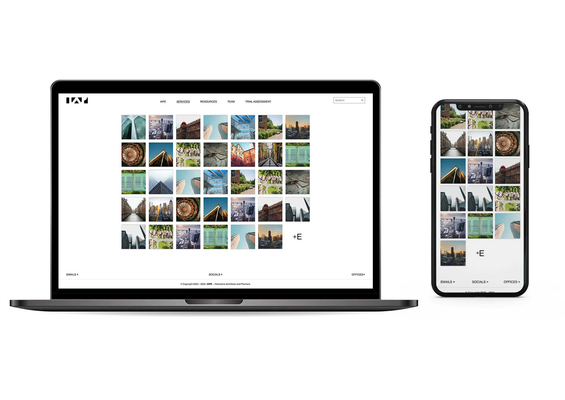 Projects
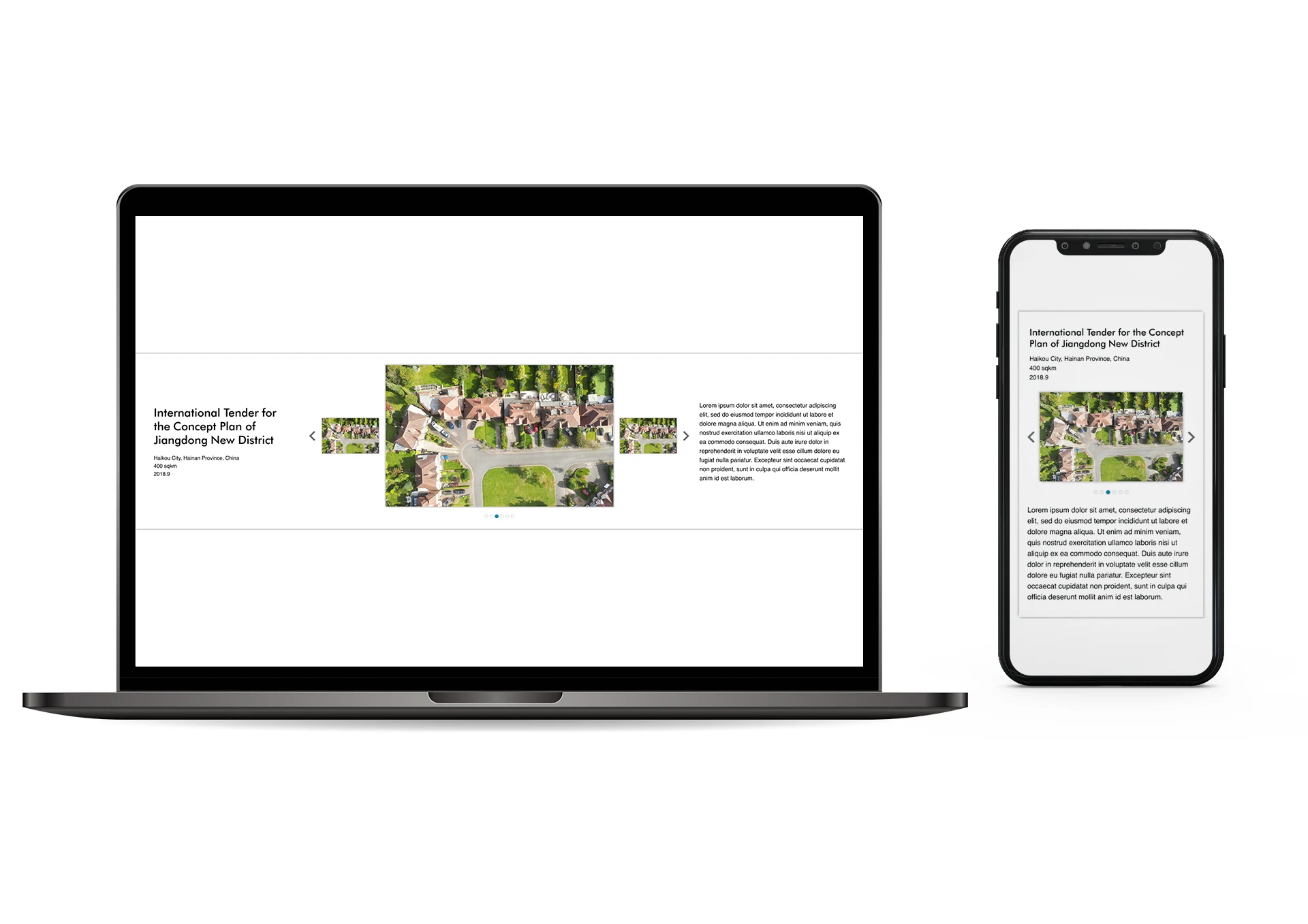 Single Project
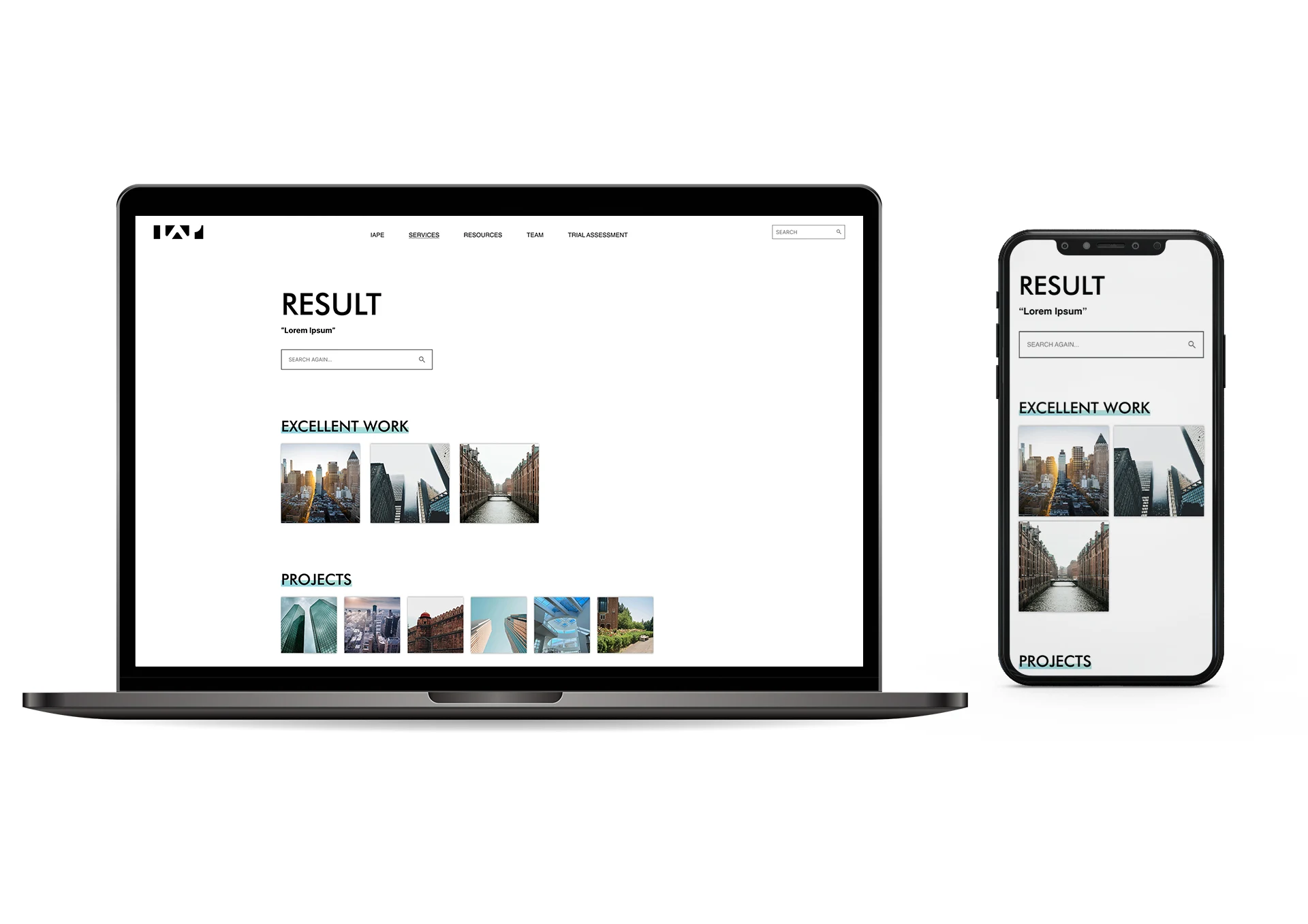 Search Result
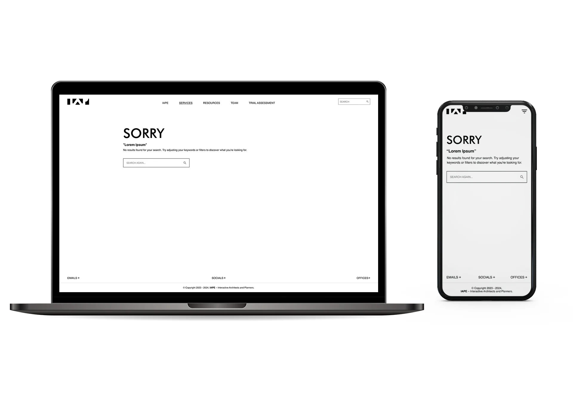 No Search Result
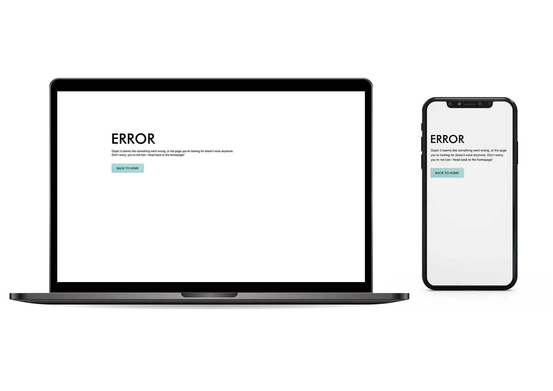 Error
Error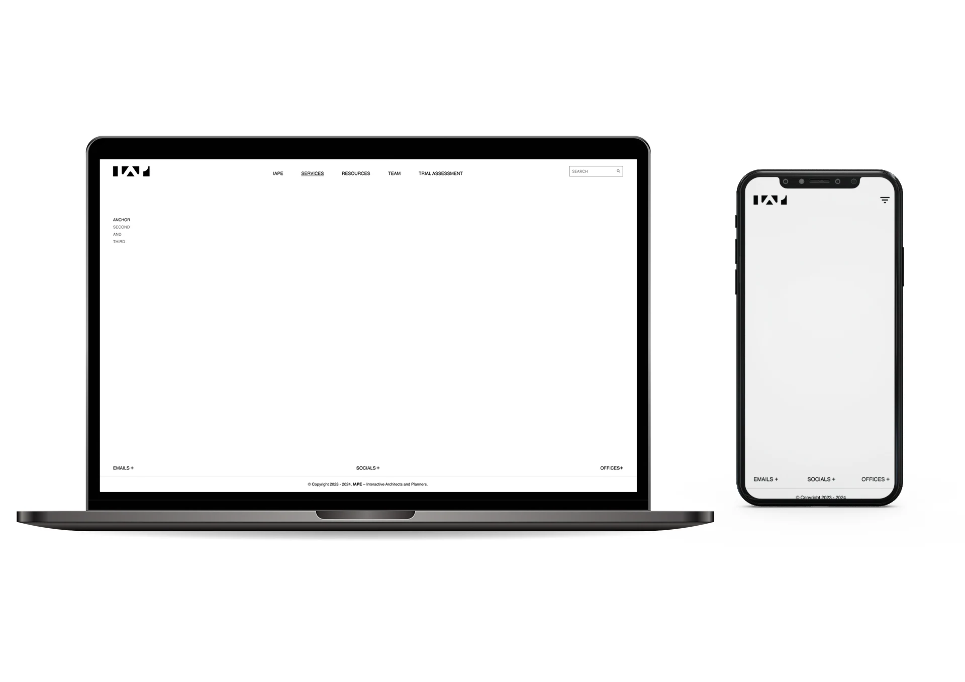 Layout
More Proud AND
AWESOME PROJECTS
Explore more exciting and awesome work! Check out the archive and fill yourself with tech world.
MORE WORK